Forms are the fundamental building blocks of interactive web applications. Everything we’ve looked at so far has been static content: users can scroll, click, and navigate around our content, but they’re not really interacting with it.
The first iteration of HTML forms included a basic set of input types:
HTML5 (which rolled out gradually from 2007-2014) introduced a whole bunch of new form types:
There’s a few things to bear in mind when you’re working with HTML inputs.
First: with the exception of <input type="file">, they are all fancy ways to make a string. Really. Everything gets reduced to text, ‘cos that’s all HTTP knows how to deal with; when the HTML5 input types were rolled, out, browsers that didn’t support them yet would fall back to a plain old <input type="text"> — or, more accurately, to <input>, since "text" is the default type — so even if you couldn’t pick a colour using a nice colour picker, you could at least type #ff9900 into the box.
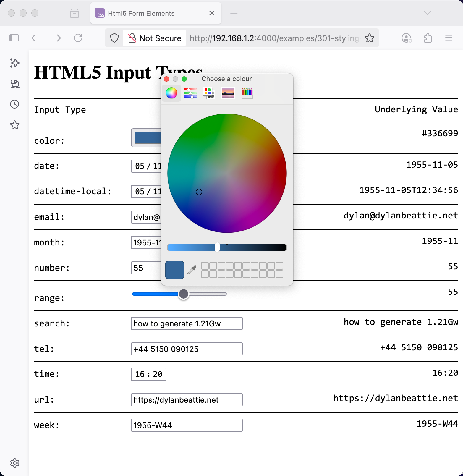
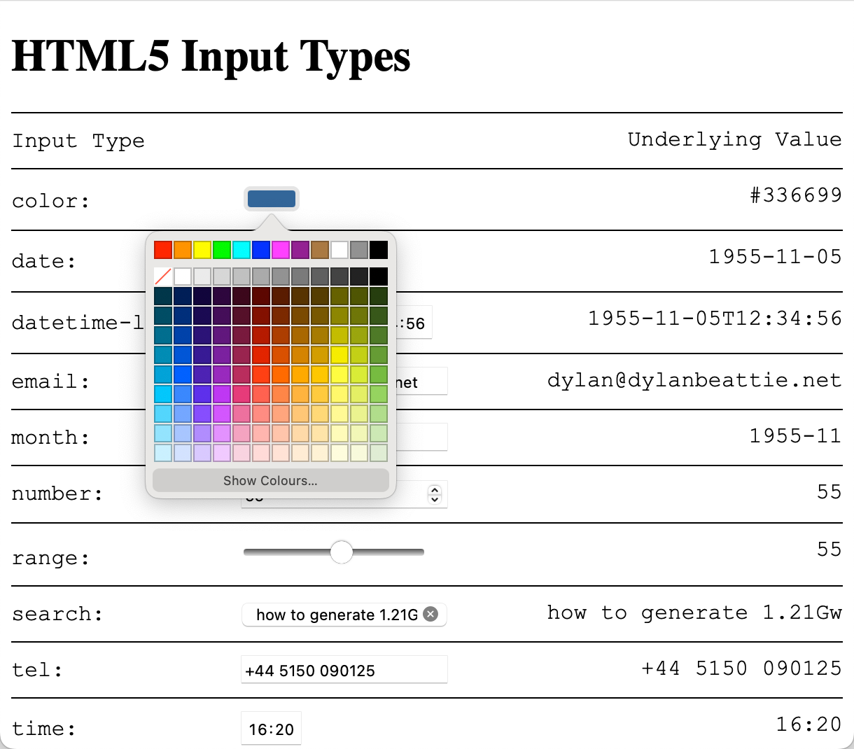
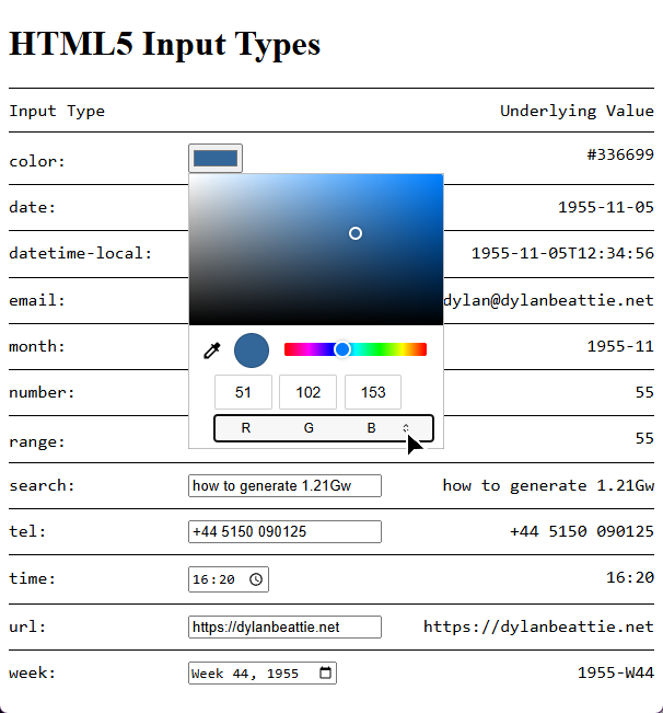
Second: you have very little control over how these form inputs actually behave. Something like the colour picker, for example - if you’re using Firefox, it’ll pop up the system colour picker, which looks like this on macOS:
and like this on Windows:
Safari on macOS has its own built-in colour picker widget:
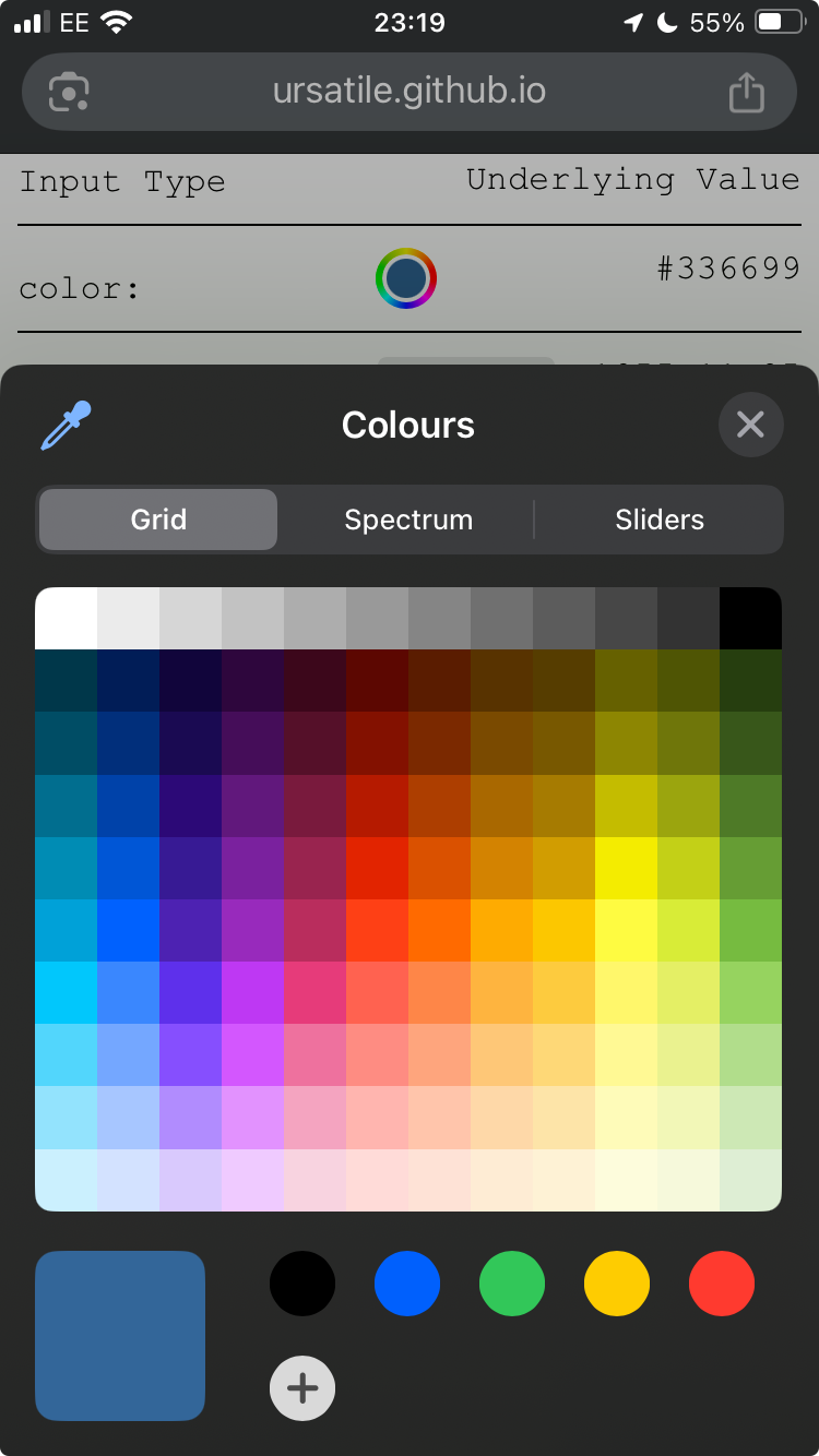
This is what you get on iOS:
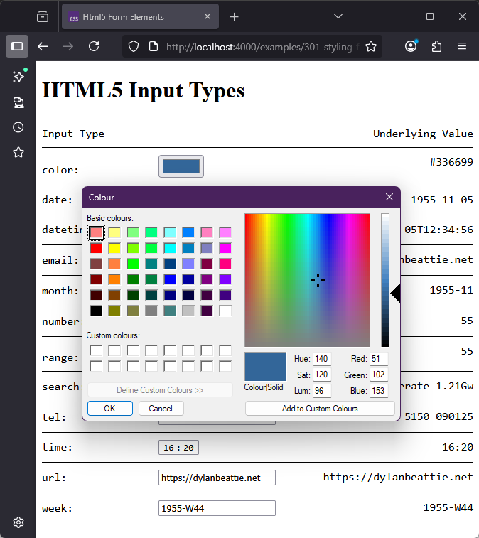
and on Chrome and Edge on Windows, it’s this:
The underlying problem here, of course, is that the web is a collision of conventions about what something like a button or a colour picker should look like. There’s one argument that says that if you’re running macOS, the buttons on the web pages should look like macOS buttons so your users know that they’re buttons. There’s another argument says that it’s your website, your buttons should look like the rest of your website.
When it comes to styling form elements, you’ll find there’s a few different approaches used on sites around the web.
Styling Inputs and Buttons
You can style text fields and buttons like just about any other element - backgrounds, borders, gradients, fonts; all the techniques we’ve looked at so far in the course:
Styling Radio Buttons and Checkboxes
Historically, browsers haven’t given developers a huge degree of control over the appearance of radio buttons and checkbox inputs.
Incidentally, if you’ve ever wondered why they’re called radio buttons? It goes all the way back to old-fashioned car radios, which had buttons to choose a preset radio station - and because you can’t tune in to two radio stations at the same time, pushing one button would release all the others. Just like how radio buttons work on the web.

Even 30 years after HTML 3.2, there’s still a lot of subtle detail about radio buttons and checkboxes that many developers haven’t encountered before. By way of a quick recap: radio buttons only let the user select one value from a group - denoted by a set of inputs with the same name attribute. Radio buttons, and groups of related checkboxes, should always be contained in a <fieldset> element, along with a <legend> element which explains the what that group of inputs is for.
Because they’re relatively small, radio buttons and checkboxes should always have an associated <label> element - it’s much easier to click on the adjacent label text than it is to click on the radio button or checkbox itself.
One way to accomplish this is to put the input inside the label:
<h4>Input Inside Label</h4>
<fieldset>
	<legend>Favourite Member of Destiny's Child</legend>
	<label>
		<input type="radio" name="destinys-child" value="beyonce"> Beyoncé
	</label>
	<label>
		<input type="radio" name="destinys-child" value="kelly"> Kelly
		Rowland </label>
	<label>
		<input type="radio" name="destinys-child" value="michelle"> Michelle
		Williams </label>
</fieldset>Another way is to give each radio button an ID, and use the for attribute to associate the labels. Remember that radio buttons in a group have the same name, so you have to give them a unique ID which can’t be the same as their name.
<fieldset>
	<legend>Favourite Member of The Police</legend>
	<input type="radio" name="the-police" value="sting" id="the-police-sting">
	<label for="the-police-sting">Sting</label>
	<input type="radio" name="the-police" value="stewart"
		id="the-police-stewart">
	<label for="the-police-stewart">Stewart Copeland</label>
	<input type="radio" name="the-police" value="andy" id="the-police-andy">
	<label for="the-police-andy">Andy Summers</label>
</fieldset>Despite this being part of the HTML standard since the 1990s, you’ll still see a lot of forms in the wild where the “label” isn’t actually a <label> element - it’s just some text alongside the button. This looks the same, but try making a selection here:
<fieldset>
	<legend>Favourite Member of Rush</legend>
	<input type="radio" name="rush" value="neil"> Neil Peart
	<input type="radio" name="rush" value="alex"> Alex Lifeson
	<input type="radio" name="rush" value="geddy"> Geddy Lee
</fieldset>If you find this easy, have a couple of drinks and then try doing it on your phone on a moving train - a completely valid technique for understanding what it’s like to use your software for somebody who has limited dexterity. The WCAG refers to this particular issue as target size; WCAG level AA requires a minimum target size of 24x24 pixels, and for compliance with level AAA (the highest accessibility standard) targets should be at least 44x44 pixels.
The problem with styling radio buttons and checkboxes is that on almost all devices, they aren’t drawn by the browser - they’re drawn by the operating system, so properties like border and background have no effect.
One option if you’re wrapping your inputs in a <label> element is to style the label; you’ll need to tweak the positioning a bit to get it to look good, but thanks to modern CSS’ support for the :has() selector, it’s easy to style the label associated with the selected checkbox to make it more obvious which one’s selected.
You can use the CSS accent-color property to change the colour of the selected input, and you can apply CSS transforms to checkboxes and radio buttons to change the element size:
	fieldset {
		accent-color: magenta;
		border-radius: 8px;
		padding: 10px;
		margin-bottom: 10px;
		border-color: #999;
		display: grid;
		grid-template-columns: repeat(4,1fr);
		label {
			border: 1px solid #999;
			margin: 2px 8px 2px 0px;
			padding: 4px 12px 4px 26px;
			position: relative;
			&:has(input[type="radio"]) { border-radius: 20px; }
			&:has(input[type="checkbox"]) { border-radius: 4px; }

			input {
				scale: 1.5;
				position: absolute;
				top: 3.5px;
				left: 2px;
			}

			&:has(input:checked) { background-color: gold; }
		}
}If you want more control than that, you’ve got to completely strip out the native element and build a new one… and the good news is, CSS will totally let us do that.
Replacing Inputs Using Appearance: None
CSS supports the appearance property for form elements. It’s a slightly weird property, with idiosyncratic support across browsers (including the appearance: --apple-pay-button value baked into iOS that’ll display an Apple Pay logo on those devices) , but appearance: none is widely supported, and does what you might expect: it’ll completely remove the platform-native version of the widget so that we can build a new one using CSS rules.
Here’s an example:
	fieldset {
		border: 2px solid black;
		border-radius: 5px;
		margin-bottom: 20px;
	}

	input[type="radio"],
	input[type="checkbox"] {
		 /* the elements don't have a color per se, but the value
		 set here determines the value of currentcolor for styling */
		color: orangered;
		appearance: none;
		width: 20px;
		height: 20px;
		border: 2px solid black;
		display: inline-grid;
		place-content: center;
		translate: 0 -1px;

		&:focus { outline: 1px solid silver; }
		&::before { transition: scale 0.2s; }
		&:disabled { border-color: #ccc; background-color: #eee; }

		&:checked {
			border-color: currentcolor;

			&::before { scale: 1; }
		}
	}

	input[type="checkbox"] {
		border-radius: 2px;

		&::before {
			content: "✔";
			font-weight: 900;
			font-size: 1.2em;
			scale: 0;
			position: relative;
			top: -1px;
		}
	}

	input[type="radio"] {
		border-radius: 12px;

		&::before {
			content: "";
			width: 9px;
			height: 9px;
			/* use box-shadow here because background-color doesn't print */
			box-shadow: inset 10px 10px currentColor;
			border-radius: 1rem;
			scale: 0;
		}
}What we’ve done here:
- Remove the original widget using
appearance: none - Create a new widget using borders, backgrounds and other CSS styling rules.
- Use a
::beforepseudo-element to create an extra element corresponding to the element’s checked state, and set it toscale: 0so doesn’t appear - Use the
:checkedselector to set the::beforeelement toscale: 1, so it appears when the element is checked - Use the
:focusselector to draw an outline around the form element when it has the focus - often overlooked, but vital for making sure your forms are navigable by users relying on keyboard navigation. - Use the
:disabledselector to give the element a different style when it’s marked as disabled and won’t respond to user events.
Finally, because we’re being fancy, there’s a one-second transition on the scale property, which gives us a cute little animation effect when a form element changes state.
Of course, we’re not restricted to recreating the original circular radio buttons and square checkboxes; we can use the same technique to create different styles of inputs with the same semantics as the original elements. Here’s a pure CSS recreation of the toggle switches used in recent versions of iOS:
	* { box-sizing: border-box; }

	fieldset {
		border: 2px solid silver;
		border-radius: 5px;
		margin-bottom: 20px;
	}

	input[type="radio"],
	input[type="checkbox"] {
		appearance: none;
		width: 36px;
		height: 20px;
		background-color: silver;
		border-radius: 10px;
		translate: 0 2px;

		display: inline-grid;
		place-content: center;

		&:focus { outline: 1px solid silver; }
		&:disabled::before { translate: 0 0;
			box-shadow: inset 1rem 1rem #ddd;
		 }

		&:checked {
			background-color: #369;

			&::before { translate: 8px 0; }
		}

		&::before {
			transition: translate 0.2s ease-in-out;
			content: "";
			width: 18px;
			height: 18px;
			box-shadow: inset 1rem 1rem white;
			border-radius: 1rem;
			translate: -8px 0;
		}
}And here’s a variant using emoji and rotation effects to replace on/off with thumbs-up / thumbs-down:
	* { box-sizing: border-box; }

	fieldset {
		border: 2px solid silver;
		border-radius: 5px;
		margin-bottom: 20px;
	}

	input[type="radio"],
	input[type="checkbox"] {
		appearance: none;
		width: 26px;
		height: 26px;
		border-radius: 12px;
		font-size: 1.2em;
		display: inline-grid;
		place-content: center;

		&:focus { outline: 1px solid silver; }

		&:checked {
			&::before { transform: rotate(0.5turn); }
		}

		&::before {
			transition: transform 0.5s;
			content: "👎";

			box-shadow: inset 1rem 1rem white;
			border-radius: 1rem;
		}
}Styling Select Lists
Drop-down lists, select lists, pick lists, whatever you & your team call them: styling them has always been a headache, to the extent that just about every project I’ve worked on, we’ve ended up plugging in some sort of custom component or JavaScript library to replace them.
Like checkboxes and radio buttons, browsers have historically relied on the underlying operating system when it comes to rendering select lists; this works great on mobiles devices, where the browser can display a completely different full-screen UI with dynamic scrolling, but it presents some challenges when it comes to styling them.
The good news is that CSS now specifies a way to target just about every part of the select list control. The bad news - you guessed it - is that they don’t work across all browsers, and in some cases, they probably never will; styling choices that make sense on a desktop device often don’t translate well to mobile, so iOS and Android browsers will fall back to their default rendering for these controls. Fortunately, the mobile browser vendors generally do a pretty good job of balancing styling and usability.
The whole point of using built-in styles rather than hiding and rebuilding the control is that you still get the inherent advantages of the underlying native control - accessibility, keyboard navigation, scaling. Don’t fight the browser; tell it your best case scenario, and let it figure out what makes sense for a particular user on a particular device.
In one sense, a <select> is a single HTML element. In another sense, it’s a <select> - which renders as a text field with an adjacent button - that wraps a bunch of other elements. Historically, these all had to be <option> elements; today they can be just about anything.
What Happened To <selectmenu> ?
In 2022, the Open UI initiative, part of the W3C, proposed a new element, <selectmenu>, which would replace the older <select> and offer developers the control and customisation that we’ve been asking for since the days of HTML 3 and Netscape Navigator.
In September 2024, a post on Google’s Chrome for Developers blog announced a proposed syntax for a customisable <select> element; a set of new selectors and pseudo-classes which developers could use to style the existing <select> control instead of replacing it with <selectmenu> - and browsers which don’t support the new syntax will just show an old-style drop-down menu.
This was very positively received; support for customisable <select> rolled out in Chrome in March 2025; at the time I’m writing this it’s available in Chrome, Edge, and Chrome for Android, but mostly unsupported in Safari and Firefox. With widespread community support for the new customisable select features, <selectmenu> was relegated to a historical footnote: nice idea, but we had a better idea.
Problem is, as recently as early 2024 people were still writing very exciting blog posts about how <selectmenu> was the future; those posts are all still out there, they’ll show up if you search for “style HTML select element”, and they’re part of the dataset that’s used to train modern AI tools; according to ChatGPT, right now (September 2025):
<selectmenu>is one of those experimental HTML elements that’s been bubbling up in the specs and some browsers, but not something you’d use in production just yet.
Don’t use it. <selectmenu> is dead, and it’s not coming back.
Styling a Customisable Select
Let’s walk through styling a <select> component, one feature at a time.
Remember: everything I’m showing you here will work in Chrome and Edge today, it’ll degrade gracefully in Firefox and Safari - in most cases all the way back to an ordinary <select> - and iOS/Android will ignore most of it by design in favour of their own select widget that’s optimised for mobile devices.
First: to opt in to the new styling features, you’ll need to add appearance: base-select to the select element:
select#custom { appearance: base-select; }
Let’s add a little style. We’re going to give our select a border and a background color. We can also use the ::picker-icon pseudo-element to target the little arrow icon:
	select {
		font-family: Arial, Helvetica, sans-serif;
		appearance: base-select;
		border: 2px solid royalblue;
		background-color: gold;
		width: 12em;

		&::picker-icon { color: crimson; }
}Looks great until we open it - but the open state - the actual dropdown menu bit doesn’t match the closed state.
To fix that, we need to use two new targets:
- The
select:openpseudo-selector matches the input, but only when the dropdown is open - The
::picker(select)pseudo-element matches the actual drop-down list.
Why
::picker(select)? Because the<select>isn’t the only input type that opens a picker, and at some future point there might be variants like::picker(input[type=datetime])and::picker(input[type=color]); the WHATWG decided that allowing developers to writeselect::pickerwas a bad idea because if you can do that, you can also writeform *::pickeror various other syntax variants that could mess things up really badly later on.
Note that ::picker(select) also needs the appearance: base-select property to tell the browser we’re opting-in to custom styling rules.
We’re going to modify the border-width and border-radius to give our open select a single rounded border, and change the colour of the select when it’s open.
We’re also going to apply a transform to the ::picker-icon, and add a transition so we get a bit of animation when we open the dropdown:
	select {
		font-family: Arial, Helvetica, sans-serif;
		appearance: base-select;
		border-radius: 5px;
		border: 2px solid royalblue;
		background-color: gold;
		width: 12em;

		&::picker-icon {
			transition: all 0.5s;
			color: royalblue;
		}

		&:open {
			background: royalblue;
			color: white;
			border-radius: 5px 5px 0 0;

			&::picker-icon {
				color: white;
				transform: rotateX(0.5turn); }
		}

		&::picker(select) {
			appearance: base-select;
			border-style: solid;
			border-color: royalblue;
			border-width: 0 2px 2px 2px;
			border-radius: 0 0 5px 5px;
			background: gold;
		}
}Next, let’s style the options in the drop-down list, including the one which is currently selected. This uses three more selectors:
optiontargets theoptionelements- this is a regular CSS element selector, it’s just never worked before.
option:checkedtargets the selected option itselfoption::checkmarktargets the checkmark indicator next to the selected option.
We’ll give each option a 2px border (except the top one, ‘cos the select already has a bottom border and we don’t want to double it up), give the selected option a blue background, and replace the checkmark with a ▶ character:
	select {
		font-family: Arial, Helvetica, sans-serif;
		appearance: base-select;
		border-radius: 5px;
		border: 2px solid royalblue;
		background-color: gold;
		width: 12em;

		&::picker-icon {
			transition: all 0.5s;
			color: royalblue;
		}

		&:open {
			background: royalblue;
			color: white;
			border-radius: 5px 5px 0 0;

			&::picker-icon {
				color: white;
				transform: rotateX(0.5turn);
			}
		}

		&::picker(select) {
			appearance: base-select;
			border-style: solid;
			border-color: royalblue;
			border-width: 0 2px 2px 2px;
			border-radius: 0 0 5px 5px;
			background: gold;
		}

		option {
			border-top: 2px solid royalblue;

			&:first-of-type { border-top: none; }

			&:checked {
				background-color: royalblue;
				color: white;
			}

			&::checkmark { content: "▶"; }
		}
}So far, so good - it’s still basically a drop-down list, it’s just a very colourful drop-down list.
Let’s go further.
Beyond Dropdown Lists
One long-requested feature has been a way to activate the drop-down from something that doesn’t look like a drop-down list. This is now possible thanks to another feature in the new customisable select module: if the first child element of the <select> is a <button>, that button will be used as the closed state of the control, and a new element, <selectedcontent>, will display the content of the currently selected <option>:
Here’s a standalone example:
	select {
		outline: 1px solid orange;
		appearance: base-select;
		border: none;

		&::picker-icon { display: none; }

		button {
			span { background-color: gold; }
			selectedcontent { background-color: turquoise; }
		}
	}
<select>
	<button>
		<span>PICK A ROCK BAND</span>
		<selectedcontent></selectedcontent>
	</button>
	<option>AC/DC</option>
	<option>Bon Jovi</option>
	<option>Cinderella</option>
	<option>Def Leppard</option>
	<option>Europe</option>
	<option>Fleetwood Mac</option>

</select>
When you combine this with styling the picker(select), and the fact that <option> elements can contain additional HTML, you can end up with something that doesn’t look anything like a regular drop-down list, but which still has all the same underlying semantics and behaviour.
	* { box-sizing: border-box; }

	select,
	::picker(select) { appearance: base-select; }
	img { width: 200px; }

	select {
		border-radius: 10px;
		border: 2px solid #000;
		background-color: black;
		color: white;
		span { display: none; }

		&::picker-icon { display: none; }
		button selectedcontent { padding: 10px; }

		&:open {
			&::picker(select) {
				display: grid;
				grid: repeat(4, 1fr) / repeat(4, 1fr);
				cursor: pointer;
				border-radius: 10px;
				padding: 10px;
				gap: 5px;
				background-color: black;
			}
		}

		option {
			border: 2px solid #000;
			border-radius: 5px;
			padding: 5px;
			display: block;
			display: grid;
			place-content: center;

			img {
				width: 100px;
				padding: 0;
				margin: 5px;
			}
		}

		option::checkmark { display: none; }
		option:checked { border: 2px solid #fff; }
	}
<select>
	<button>
		<selectedcontent></selectedcontent>
	</button>
	<option value="acdc-back-in-black">
		<img src="album-covers/acdc-back-in-black.jpg" alt="AC/DC - Back in Black">
		<span>AC/DC - Back in Black</span>
	</option>
	<option value="blondie-blondie">
		<img src="album-covers/blondie-blondie.jpg" alt="Blondie - Blondie">
		<span>Blondie - Blondie</span>
	</option>
	<option value="bon-jovi-slippery-when-wet">
		<img src="album-covers/bon-jovi-slippery-when-wet.jpg"
			alt="Bon Jovi - Slippery When Wet">
		<span>Bon Jovi - Slippery When Wet</span>
	</option>
	<option value="bruce-springsteen-born-in-the-usa">
		<img src="album-covers/bruce-springsteen-born-in-the-usa.jpg"
			alt="Bruce Springsteen - Born in the USA">
		<span>Bruce Springsteen - Born in the USA</span>
	</option>
	<option value="david-bowie-heroes">
		<img src="album-covers/david-bowie-heroes.jpg" alt="David Bowie - Heroes">
		<span>David Bowie - Heroes</span>
	</option>
	<option value="don-mclean-american-pie">
		<img src="album-covers/don-mclean-american-pie.jpg"
			alt="Don McLean - American Pie">
		<span>Don McLean - American Pie</span>
	</option>
	<option value="duran-duran-rio">
		<img src="album-covers/duran-duran-rio.jpg" alt="Duran Duran - Rio">
		<span>Duran Duran - Rio</span>
	</option>
	<option value="electric-light-orchestra-time">
		<img src="album-covers/electric-light-orchestra-time.jpg" alt="Electric Light Orchestra - Time">
		<span>Electric Light Orchestra - Time</span>
	</option>
	<option value="magnum-wings-of-heave">
		<img src="album-covers/magnum-wings-of-heaven.jpg" alt="Magnum - Wings of Heaven">
		<span>Magnum - Wings of Heaven</span>
	</option>
	<option value="marillion-brave" selected>
		<img src="album-covers/marillion-brave.jpg" alt="Marillion - Brave">
		<span>Marillion - Brave</span>
	</option>
	<option value="pearl-jam-ten">
		<img src="album-covers/pearl-jam-ten.jpg" alt="Pearl Jam - Ten">
		<span>Pearl Jam - Ten</span>
	</option>
	<option value="pink-floyd-the-dark-side-of-the-moon">
		<img src="album-covers/pink-floyd-the-dark-side-of-the-moon.jpg"
			alt="Pink Floyd - The Dark Side of the Moon">
		<span>Pink Floyd - The Dark Side of the Moon</span>
	</option>
	<option value="queensrÿche-empire">
		<img src="album-covers/queensrÿche-empire.jpg" alt="Queensrÿche - Empire">
		<span>Queensrÿche - Empire</span>
	</option>
	<option value="rem-automatic-for-the-people">
		<img src="album-covers/rem-automatic-for-the-people.jpg"
			alt="REM - Automatic for the People">
		<span>REM - Automatic for the People</span>
	</option>
	<option value="threshold-dead-reckoning">
		<img src="album-covers/threshold-dead-reckoning.jpg"
			alt="Threshold - Dead Reckoning">
		<span>Threshold - Dead Reckoning</span>
	</option>
	<option value="van-halen-5150">
		<img src="album-covers/van-halen-5150.jpg" alt="Van Halen - 5150">
		<span>Van Halen - 5150</span>
	</option>
</select>TODO: summary of select list elements and pseudo-classes.
What About Multiple Selects?
HTML has always supported multiline selects, and the little-known multiple attribute that allows the user to select more than one option simultaneously:
	select {
		font-family: Arial, Helvetica, sans-serif;
		appearance: base-select;
		border-radius: 5px;
		border: 2px solid royalblue;
		background-color: gold;
		width: 12em;

		&::picker-icon {
			transition: all 0.5s;
			color: royalblue;
		}

		&:open {
			background: royalblue;
			color: white;
			border-radius: 5px 5px 0 0;

			&::picker-icon {
				color: white;
				transform: rotateX(0.5turn);
			}
		}

		&::picker(select) {
			appearance: base-select;
			border-style: solid;
			border-color: royalblue;
			border-width: 0 2px 2px 2px;
			border-radius: 0 0 5px 5px;
			background: gold;
		}

		option {
			border-top: 2px solid royalblue;

			&:first-of-type { border-top: none; }

			&:checked {
				background-color: royalblue;
				color: white;
			}

			&::checkmark { content: "▶"; }
		}
	}
<select size="8" multiple>
	<optgroup label="UK Bands">
		<option>Black Sabbath</option>
		<option>Def Leppard</option>
		<option selected>Iron Maiden</option>
		<option selected>Judas Priest</option>
		<option selected>Pink Floyd</option>
		<option>Thunder</option>
	</optgroup>
	<optgroup label="US Bands">
		<option>Alice in Chains</option>
		<option selected>Bon Jovi</option>
		<option>Cinderella</option>
		<option selected>Eagles</option>
		<option selected>Foreigner</option>
		<option>ZZ Top</option>
	</optgroup>
</select>Styling File Inputs
TODO: styling file inputs
https://moderncss.dev/pure-css-custom-styled-radio-buttons/
https://www.smashingmagazine.com/2021/09/simplifying-form-styles-accent-color/
https://www.scottohara.me/blog/2021/09/24/custom-radio-checkbox-again.html