So far, we’ve learned about the building blocks of the CSS language - selectors, properties, and values - and the tools and techniques we can use to inspect and manipulate those properties.
Time to dive into how CSS actually works, and why.
The Grain of the Web
If you’ve ever worked with wood, or textiles, you’ll know that these materials have a grain; an intrinsic structure that’s aligned in a particular direction. Experienced crafters know how to work with the grain of the material, because it yields better results. If you’re turning a piece of tree trunk into a guitar neck, you absolutely want the grain of the wood running along the neck, not across it - and if you try to work against the grain, and you’ll end up with all sorts of problems.
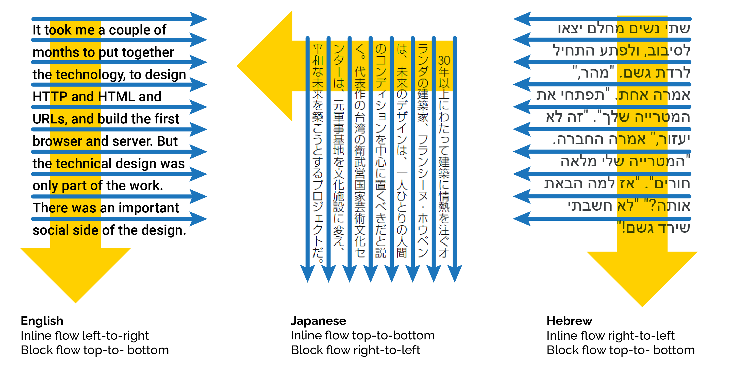
The web also has a grain; a natural direction and flow, derived from the printing and typesetting conventions used in many Western countries. Text starts at the top left corner of the page, every line reads left to right. If a line’s too wide for the screen, it’ll wrap - but if a paragraph is too tall for the screen, it’ll scroll.
That might sound obvious, but it’s the key to understanding how the browser lays out elements on a page - and to what we’ll need to do if we don’t want our website laid out like a printed textbook from the 1950s.
Inline and Block Elements
Let’s start here, with an empty web page.
<!DOCTYPE html>
<html lang="en">
<head>
<meta charset="UTF-8">
<title>Boxes & Borders</title>
</head>
<body>
</body>
</html>Anything we add to that page is going to appear in the top left corner. Let’s add a paragraph that just says “Hello World!”:
A paragraph is what’s known as a block-level element: it always starts on a new line, and it always takes up the full width of the page. Copy & paste that paragraph a few times:
Now, if you use the inspector tool to examine those paragraphs, you’ll see that each one is a distinct block, and they’re all the full width of the page.
Next, let’s put a bunch of <em> tags inside the first paragraph:
Theem element is what’s called an inline element. It doesn’t start a new line, and it’s only as big as it needs to be to contain its own content.
Now, when you’re using HTML to mark up documents, you’ll find the built-in tags cover most of the things you’ll need - headings, lists, articles, images. But once you get into using HTML to create web applications and user interfaces, it’s not always quite so straightforward: sometimes, you’ll want an element that doesn’t intrinsically mean anything, because it’s going to end up as a falling block in a puzzle game, or a support ticket you can drag around in some kind of helpdesk system.
Modern HTML provides two elements specifically for those scenarios: div and span. An HTML div is, literally, a block-level element that doesn’t mean anything. And a span is - yep, you guessed it - an inline element that doesn’t mean anything.
Let’s throw a few divs and spans into our page to see what happens:
<!DOCTYPE html>
<html lang="en">
<head>
<meta charset="UTF-8">
<title>Boxes & Borders</title>
</head>
<body>
<div>This is an HTML div element.</div>
<div>This is an HTML div element.</div>
<div>This is an HTML div element containing some span elements.
<span>This is a span.</span>
<span>This is another span.</span>
<span>This is yet another span.</span>
</div>
<p>This is a paragraph</p>
<p>This is a paragraph</p>
<p>This paragraph contains <em>emphasis</em> <em>elements</em></p>
</body>
</html>You’ll notice two differences here. One: the emphasis tags are in italics, whereas the span tags are just regular text. Two: there’s vertical spacing between the paragraphs, but no vertical spacing between the div elements.
Time to meet the CSS box model.
The CSS Box Model
CSS is based on boxes. Every element on a page sits inside an invisible bounding rectangle, sometimes known as the content box, which the browser uses to determine where to draw that element, and how big it should be.
TODO: artwork illustrating CSS content box
We’ve already met the CSS outline property, which tells the browser to make the bounding rectangle visible, but doesn’t change the size, or shape, of the element. See what happens if we take several adjacent DIV elements and add a rule that gives them a 1 pixel red outline:
If you crank up the browser’s page zoom here, you’ll see that the outline doesn’t correspond exactly to the edges of the letters on all sides - there’s a gap along the top, and the outline touches the descenders on lowercase letters like j and g. The exact size of the bounding box is dictated by the typeface we’re using; it’s related to something called font metrics, which we’ll talk about in the section on text and typography.
If we crank up the outline - 2px, 5px, 10px, 20px - you can clearly see that the browser isn’t moving anything around to make space for an outline; it’s just drawing it over the top of what’s already there. Useful for debugging… for actually styling pages and user interfaces? Not so much.
Instead, CSS has a property called border. Let’s change that rule to give our div elements a 1 pixel red border:
TODO: artwork demonstrating CSS border
And now, if we change the thickness to 2, 5, 10, 20 pixels, you can see how the layout changes each time so that the border doesn’t obscure the contents.
TODO: artwork demonstrating border-width
If you want a space between the content and the border, use the CSS property called padding. Unlike border, padding doesn’t actually draw anything, it just creates empty space, so we don’t give it a style or a colour - just a measurement:
div {
    padding: 5px;
}
As before, try changing the padding to 15, 25, 50 pixels, and see how it affects the layout.
Finally, if you want space around an element, outside the border, use the CSS property called margin:
div {
	margin: 5px;
}
Collapsing Margins
Margins in CSS behave a little differently to borders and padding because of something called margin collapse. If two adjacent elements both declare a margin, they’ll be rendered with their margins overlapping: CSS doesn’t add their margins together; instead it ensures the elements are separated by the greater of the two margin distances specified.
Take a look at this example:
<!DOCTYPE html>
<html lang="en">
<head>
<meta charset="UTF-8">
<title>Boxes & Borders</title>
<style>
h1 {
outline: 1px solid red;
margin: 0px;
}
p {
outline: 1px solid blue;
margin: 0px;
}
</style>
</head>
<body>
<h1>Jackdaws love my big sphinx of quartz.</h1>
<p>Five wizards quickly hex jumping bot.</p>
<p>Bright vixens jump; dozy fowl quack.</p>
<p>Quick zephyrs blow, vexing daft Jim.</p>
<p>Pack my box with five dozen liquor jugs.</p>
<p>Bad quacks might jinx very zippy fowl.</p>
</body>
</html>If you modify the rule to give the h1 element a 20 pixel margin, you’ll get this:
Now if you also give the p elements a 10px margin, you get this:
See how the total distance between the heading 1 and the first paragraph there is 20 pixels? The browser has collapsed the two elements’ margins: the h1 is 20 pixels away from the paragraph, which is fine, and the paragraph is more than 10 pixels away from the heading, which is also fine.
The Terrible Trouble with Borders and Margins
That last example looks a little odd, right? Using margins to create vertical spacing can help make the page more readable, but it shouldn’t mess with the left and right alignment.
So far, we’ve used a shorthand syntax when specifying property values; we say margin: 20px and we get 20px of margin at the top, right, bottom, and left of every matching element.
Instead, we can specify distances individually:
p {
    margin-top: 10px;
    margin-right: 0;
    margin-bottom: 20px;
    margin-left: 0;
}

/* which is equivalent to: */
p {
    margin: 10px 0 20px 0;
}
The second rule there is using what’s sometimes called TRBL shorthand: the values apply clockwise from the top: top > right > bottom > left. I usually remember this because it matches the consonants in the word trouble. There’s also a 2-value and a 3-value shorthand syntax:
/* CSS two-value syntax: top & bottom, right & left */
p {
    margin: 10px 20px;
}

/* CSS three value syntax: top, right & left, bottom */
p {
    margin: 10px 20px 30px;
}
When it comes to borders, there’s a whole bunch of ways we can combine the various properties. Each edge of the element can have a border-width, a border-style, and a border-color - and any of these properties can use any of the shorthand syntaxes above:
p {
	padding: 10px;
	margin: 15px;
}

p#example1 {
	border-width: 5px 10px 15px 20px;
	border-style: double dotted dashed groove;
	border-color: red green yellow blue;
}

p#example2 {
	border-top: 2px solid green;
	border-right: 4px dotted red;
	border-bottom: 6px dashed blue;
	border-left: 8px groove yellow;
}
p#example3 {
	border-width: 10px 5px;
	border-style: double;
	border-color: grey;
}
p#example4 {
	border: 5px outset lightgrey;
	background: lightgrey;
}The border-style property must take one of the values defined in the CSS spec:
Wondering why
noneandhiddendo the same thing? It’s all to with border collapse, which we’ll meet in a later section, but the short answer is: if you combine asolidborder with anoneborder, thesolidborder wins. If you combine asolidborder withhiddenborder, thehiddenwins.
The border-color can be any CSS color — we’ll learn all about those in the section on colors and composition a little later — and the border-width can be any CSS length unit, so now’s probably a great time to learn about CSS units and how they work.
Introducing CSS Units
Every example we’ve looked so far has specified the border width, padding, margin, etc. in pixels, but CSS has a remarkably flexible systems of units and measurements. The most common measurement you’ll find in CSS is length, and lengths in CSS come in two varieties: absolute and relative.
Absolute Units
Absolute units are, well, absolute: they don’t depend on anything else. If we specify something has a 10px border, that border will always be 10 pixels… well, sort of. Way back when CSS was first developed, pixels referred to actual physical device pixels - if your screen resolution was 800x600, and you drew a box that was 400 pixels wide and 300 pixels high, that box would fill exactly a quarter of your screen.
Two quite important things have happened since then. First: just about every browser now has a page zoom feature, which makes everything bigger - and it does this by changing how many physical pixels are used to draw a logical pixel. If you have a line that’s 10 pixels thick, and you crank the browser’s page zoom up to 200%, that line will now be 20 pixels thick.
Second: many devices now use high-definition displays; the physical pixels on something like an iPhone Retina display are so small that a 1 pixel line would basically be invisible, so these devices use something called pixel scaling: if you tell an iPhone to draw a 1px border, it’s actually going to use three tiny Retina pixels to draw that line.
Good news is: you don’t have to worry about it. We’ll see a couple of techniques later which do utilise the capabilities of high-DPI displays, but they’re absolutely not required; if you want to specify things in pixels, go ahead: the devices will figure out.
The point is: if there are a bunch of things on your web page which are specified as being 10 pixels, they will all be exactly the same size as each other.
CSS also supports absolute lengths specified in centimetres, millimetres, inches, in points - a point is a typesetting unit equal to 1/72ndth of an inch - and picas - 1/6th of an inch. And, apparently, in quarter-millimetres. These kinds of units are handy if you’re using CSS to style something that’s going to end up printed on paper, but it’s really not a good idea to use them for styling onscreen content.
There’s one more absolute measurement we should mention here, and that’s zero. Zero doesn’t have a unit, because zero pixels is the same as zero centimetres is the same as zero inches: it’s all still zero.
Absolute units are useful for creating pixel-perfect layouts, but that’s not always a good idea, because there’s a bunch of things you can’t control. You have no control over how wide, or how tall, your user’s browser window is; over what sort of device they’re viewing your pages on, or whether they’ve adjusted their default font size. For all these reasons, it’s generally a much better idea to create responsive layouts by using relative units.
Relative Units
Relative units are how CSS lets us specify things like “make this half the height of the current window”, or “this should take up two-thirds of its container”, or “bigger text should have a thicker border.”
ems and rems
An em is another unit from the days of mechanical typesetting - and has nothing to do with the HTML <em> element we’ve seen; it’s just bad luck that we’re only just getting warmed up and we’ve already got two completely different things that are both called em.
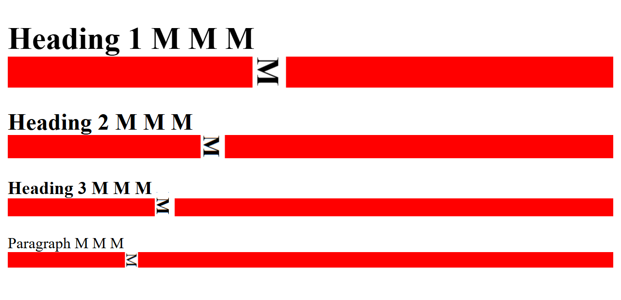
Lines and columns of printing type would be set using cast metal blocks, one for each letter; the capital letter M was usually the largest shape - or glyph - in a particular typeface. Typesetters used a tool called a composing stick to set the width of a column of type; if the column had to be 24 ems wide, they’d use 24 capital M blocks to set the width - and because desktop publishing and digital typesetting adopted many terms and units from mechanical typesetting, one em became a unit as wide as a capital letter M in the currently selected font.
By the way, in computing, we use the terms font and typeface interchangeably, but in typesetting, a font is a specific typeface at a specific size and weight. So Arial is a typeface, Arial 20pt bold is a font.
Here’s an example page:
We’ve given every element on the page a bottom border that’s 1em thick:
body {
	* {
		border-bottom: 1em solid red;
	}
}See how the Heading 1 has a much bigger border, because the browser renders it in a larger font and the border size is relative to the font size? If you zoom in close and crop things around a bit, you can actually see how the border in each case matches the width of the letter ‘M’ in that element:
A rem is an em but it’s relative to the root font size - so it’ll give you a consistent unit which doesn’t vary between headings, paragraphs, etc., but which does reflect changes to the document’s — or the browser’s — default font size.
Modern CSS also supports the following units; relative to the element’s font, and their r- versions relative to the document root font:
cap/rcap= cap height, the height of a capital letterch/rch= the advance measure of the digit 0; width if text is flowing horizontally, height if text is flowing vertically.ex/rex, the height of a lowercase “x”lh/rlh, the line heightic/ricthe width of the “水” glyph (CJK water ideograph, U+6C34)
	span {
		margin: 0 10px 5px 0;
		border: 0px solid black;
		padding: 5px;
		background-color: silver;
		display: inline-block;
		width: 100px;
		box-sizing: border-box;
	}

	span.em		{ border-width: 0 1em 0 0; }
	span.rem 	{ border-width: 0 1rem 0 0; }
	span.cap 	{ border-width: 0 1cap 0 0; }
	span.rcap { border-width: 0 1rcap 0 0; }
	span.ch 	{ border-width: 0 1ch 0 0; }
	span.rch 	{ border-width: 0 1rch 0 0; }
	span.ex 	{ border-width: 0 1ex 0 0; }
	span.rex 	{ border-width: 0 1rex 0 0; }
	span.lh 	{ border-width: 0 1lh 0 0; }
	span.rlh 	{ border-width: 0 1rlh 0 0; }
	span.ic 	{ border-width: 0 1ic 0 0; }
span.ric { border-width: 0 1ric 0 0; }As of August 2025, Firefox doesn’t support
rcap,rch,rex, orric.
Percentages
Let’s get to know another couple of CSS properties: width and height. These ones do pretty much what you’d expect them to do:
h1 {
	width: 200px;
	height: 100px;
	background-color: purple;
}
h2 {
	width: 400px;
	height: 50px;
	background-color: teal;
}
p {
	width: 600px;
	background-color: yellow;
}Note how elements with a width are aligned to the left edge of the page. Also notice how, if you resize the browser window, these elements don’t change size, because their width and height are specified in absolute units.
Now, change the CSS to this:
h1 {
	width: 50%;
	background-color: purple;
}
h2 {
	width: 50vh;
	background-color: teal;
}
p {
	height: 25vw;
	background-color: yellow;
}➡️ width-and-height-relative.html
Now watch what happens if you change the size of your browser window.
The <h1>? That’s 50% of the width of its parent element — in this case the document <body> - and so always takes up half the width of the screen.
The <h2> has its width set to 50vh. vh is a CSS unit equal to one-hundredth of the viewport height - so as we change the height of the window, the width of the <h2> element changes so that it’s always half of the window height. And the <p> element has its height set based on vw - the viewport width
Now, this is a great example of a stupid demo. You will never, ever, ever build a real web page or application in which a heading changes width based on the height of the window — well, maybe if you were building some sort of bizarre online puzzle game — but it does demonstrate really clearly what units like vw and vh actually do.
Auto
One more relative unit that’s remarkably useful in CSS is auto. Most of the time, auto happens automatically — the height of a paragraph will be automatically set to the size of its content, for example.
One extremely useful, but slightly counter-intuitive, application of auto is that if you give an element a fixed width and then set the left and right margin of that element to auto, the browser will centre the element horizontally.
<!DOCTYPE html>
<html lang="en">
<head>
	<title>Centering Elements with Auto Margins</title>
	<style>
		div {
			color: white;
			background-color: grey;
			padding: 20px;
			margin: 1em auto;
		}
	</style>
</head>
<body>
	<div style="width: 300px;"><code>width: 300px;</code></div>
	<div style="width: 40%;"><code>width: 40%;</code></div>
	<div style="width: 80%;"><code>width: 80%;</code></div>
	<div style="width: 60vh;"><code>width: 60vh;</code></div>
</body>
</html>Float Like A Butterfly…
Even if a block-level element has a defined width, the browser’s layout engine still allocates a full page width of space for that element — and by default, the element is drawn flush with the left edge of the page, and the next element is drawn starting underneath it.
The CSS float property lets us pull an element out of the regular document flow and float it to the left or right edge of its container. - check out floats.html to see it in action.
<!DOCTYPE html>
<html>
<head>
	<title>Float Example</title>
	<style>
		aside {
			float: right;
			width: 20%;
			background-color: pink;
			padding: 1em;
			margin: 0 0 1em 1em;
		}

		blockquote {
			float: left;
			width: 20%;
			display: inline;
			background-color: cornflowerblue;
			padding: 1em;
			margin: 0 1em 1em 0;
		}

		div {
			float: left;
			width: 1.6em;
			height: 1.6em;
			background-color: teal;
			margin: 0.2em;
		}
	</style>
</head>
<body>
	<article>
		<aside>Using the CSS float property, we can pull an element out of the
			regular document flow and float it to the left or right edge of its
			container.
		</aside>
		<p>Lorem ipsum dolor sit amet, consectetur adipiscing elit. Nunc hendrerit
			metus nec nulla pellentesque, vel ornare magna vulputate. Mauris ac leo at
			risus iaculis tristique ut a orci. Aliquam erat volutpat. In a leo felis.
			Aenean facilisis elit purus, ullamcorper viverra quam sodales eget.
			Phasellus vehicula, mauris quis sagittis convallis, elit tortor rhoncus
			erat, vel feugiat ante urna sit amet ex. Vestibulum id justo in neque
			bibendum varius.</p>
		<p>Morbi sit amet vulputate velit. Praesent eu efficitur nisi, a viverra ex.
			Cras nunc erat, dictum sit amet condimentum quis, gravida sit amet
			urna. Integer ultricies fermentum egestas. Vestibulum a dolor vitae leo
			hendrerit mollis sit amet aliquet diam. Nunc euismod aliquam gravida. Ut
			suscipit sapien odio, ac sagittis eros bibendum eu. Fusce condimentum quam
			vel commodo vestibulum.</p>
		<blockquote><q>Float like a butterfly, sting like a bee</q>
			<cite> - Mohammad Ali</cite>
		</blockquote>
		<p>
			Fusce cursus efficitur neque, eget commodo mauris
			auctor eu. Etiam tempus, nibh id tincidunt consequat, metus massa rutrum
			dui, auctor pretium orci augue et lectus. Phasellus lacinia hendrerit
			luctus. Fusce eget turpis ac nisl ornare lacinia. Maecenas in urna dui.
			Phasellus nec feugiat mauris, sit amet iaculis ligula. Maecenas non urna
			non lectus tristique feugiat iaculis sed dolor. Fusce molestie mattis erat
			eget interdum.</p>
		<p>Pellentesque scelerisque elit orci, in lobortis nisl dictum eu. Duis diam
			mi, luctus sit amet odio nec, accumsan pharetra libero. Curabitur augue
			risus, congue ut ligula vitae, aliquet viverra metus. Vestibulum blandit
			neque a dolor sagittis, vitae rutrum lorem ultrices. Phasellus nunc mi,
			bibendum eu scelerisque vel, molestie tempus lorem. Nam maximus commodo
			turpis quis porta. Sed sit amet sapien ut lacus ullamcorper dignissim sit
			amet ut eros. Curabitur dignissim magna eu arcu consectetur, vel varius
			dolor sollicitudin.</p>
		<div></div>
		<div></div>
		<div></div>
		<p>Curabitur pulvinar, nisi a consectetur congue, erat tortor dapibus
			tortor, a sagittis justo velit pulvinar sem. Sed imperdiet venenatis
			venenatis. Sed faucibus, sapien a rhoncus pharetra, nunc dui ultrices
			justo, sit amet pellentesque purus nibh in neque. Maecenas ornare libero
			vel cursus consectetur. Duis quis dolor mi. Mauris facilisis nibh ut augue
			rutrum condimentum et id ante. Integer pellentesque massa ut magna
			condimentum, sed vehicula lectus elementum.</p>
	</article>

</body>
</html>CSS Box Sizing
Take a look at the code in box-sizing.html:
There’s a <section> containing two <div> elements; there’s a rule saying <div> elements have width: 50% and float: left - so the first one should take up half of the section and leave space for the second one alongside it… right?
Welcome to another historical quirk of CSS: box sizing. CSS uses two different sizing models — border-box and content-box.
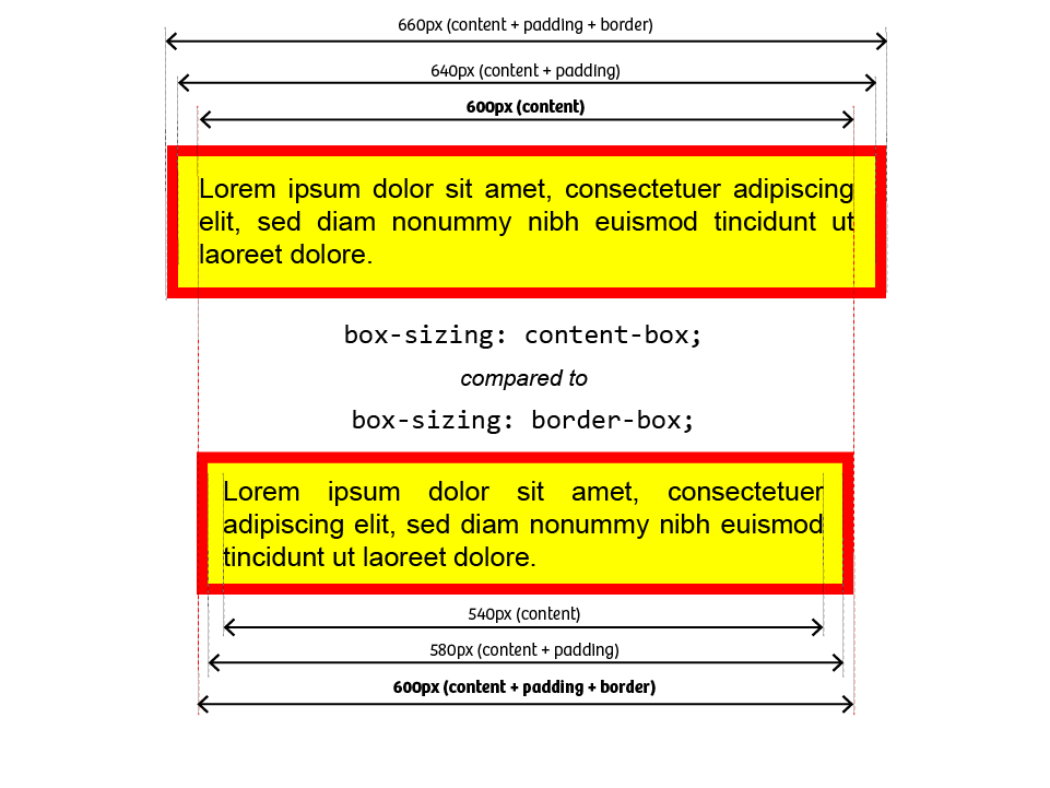
content-box vs border-box - With
content-boxsizing, the element’s content is drawn at the specified width and height, and then the padding and border are drawn outside the content. - With
border-boxsizing, the width and height are applied to the outside of the border, so if you say something’s 50% wide, that element, including its padding and border, will be half the width of its container.
In 25 years of web development, I have never, ever encountered a situation where content-box solved my problem; it’s border-box every single time. Except… content-box is the default. It shouldn’t be the default, but it is.
If we modify our example CSS to override the default:
	div {
		width: 50%;
		float: left;
		padding: 10px;
		border: 2px solid black;
		background-color: hotpink;
		box-sizing: border-box;
	}
<section>
	<div>Lorem ipsum dolor sit amet, consectetur adipiscing elit. Sed euismod,
		urna eu tincidunt consectetur, nisi nisl aliquam nunc, eget aliquam massa
		nisl quis neque. Pellentesque habitant morbi tristique senectus et netus
		et malesuada fames ac turpis egestas.</div>
	<div>Lorem ipsum dolor sit amet, consectetur adipiscing elit. Sed euismod,
		urna eu tincidunt consectetur, nisi nisl aliquam nunc, eget aliquam massa
		nisl quis neque. Pellentesque habitant morbi tristique senectus et netus
		et malesuada fames ac turpis egestas.</div>
</section>we can get our <div> elements to render side-by-side:
Using inline-block
We’ve met block elements and inline elements, but sometimes you need an element which behaves like a block - width, height, margins - but is treated as an inline element for layout purposes. That’s what display: inline-block is for.
	em {
		display: inline-block;
		background-color: gold;
		border: 1px solid royalblue;
		padding: 10px 5px;
		margin: 5px;
	}

	strong {
		height: 3em;
		background-color: lime;
		display: inline-block;
	}

	p#vertical-align-examples {
		outline: 1px solid gold;
		line-height: 5rem;

		code {
			line-height: normal;
			padding: 0.25rem;
			background-color: gold;
			display: inline-block;
		}
	}
<p>Using <code>display: inline-block;</code> you can put elements in your page
	which have <em>block characteristics</em> like height and vertical margins,
	but which are treated like <strong>inline</strong> elements for layout
	purposes. They don't create a new block context, they don't cause a line
	break, and they have an implicit width based on the size of their content,
	rather than taking up the full width of the viewport.</p>

<p id="vertical-align-examples">vertical-align:
	<code style="vertical-align: baseline;">baseline (default)</code>,
	<code style="vertical-align: middle;">middle</code>,
	<code style="vertical-align: top;">top</code>,
	<code style="vertical-align: bottom;">bottom</code>,
	<code style="vertical-align: super;">super</code>, and
	<code style="vertical-align: sub;">sub</code>, and
	<code style="vertical-align: text-top;">text-top</code>
</p>Let’s meet a classic “gotcha” that almost every web developer will meet at some point in their career. We’ve got three <div> elements, we’re going to give them a width of 33% and display: inline-block to get three elements side-by-side…
	div {
		font-family: Consolas, 'Courier New', Courier, monospace;
		box-sizing: border-box;
		display: inline-block;
		background-color: gold;
		padding: 10px 5px;
		width: 33%;
	}
<div>width: 33%;</div>
<div>width: 33%;</div>
<div>width: 33%;</div>But then you look at the same page in a slightly narrower viewport:
…and one of the <div> elements has dropped to the next line. What’s going on?
This is one of those classic scenarios that’s completely baffling until you work it out… and completely obvious in hindsight.
First: there is actually space between those elements. If there’s whitespace between inline elements in the HTML source, it’ll get preserved - multiple spaces get collapsed down to a single space, but you’ll still get a single space. If you don’t want whitespace between your elements, you can’t have any whitespace between them in the HTML source:
<p><em>there</em><code>are</code><strong>NO</strong><kbd>spaces</kbd>here</p>
<p><em>there</em> <strong>are</strong> <code>spaces</code> <kbd>here</kbd></p>
<p>
	<em>there</em>    <!-- loads of whitespace here! -->    <strong>are</strong>


	<code>spaces</code>


	<kbd>here</kbd>
</p>Second: when you specify display: inline-block, the target elements are treated as inline for display purposes - which means if there’s any whitespace between them, you’ll get a space in your output. And our source looks like this:
    <div></div>
    <div></div>
    <div></div>
…so there’s a newline and a tab between each <div> element.
Third: percentages and rounding. Three elements with width: 33% adds up to a total width of 99% - so we’ve got one percent of the total viewport width left to play with. On my system, as long as the viewport is over 812px wide, those two whitespaces are smaller than the 1% of available space, so nothing wraps… but if I shrink the viewport below 812px, it won’t fit on one line any more, and the browser wraps it only multiple lines as it would with any other inline content.
The fix is to put the <div> elements on the same line in source… but that brings us to the fourth problem: most code editors are smart enough that if you’ve got adjacent inline elements with no spaces between them, it’ll keep them on the same line… but they don’t do that with <div> elements ‘cos the editor isn’t smart enough to read the CSS and figure out those elements are going to be inline.
If you ask VS Code to reformat <em>one</em><em>two</em><em>three</em>, it won’t insert any line breaks… but if you reformat a file with
<div>one</div><div>two</div><div>three</div>
you’ll end up with:
<div>one</div>
<div>two</div>
<div>three</div>
As a general rule, it’s safe to apply inline-block to elements that are intrinsically inline — <span>, <code>, <strong>, <em> — but if you apply it to block-level elements like <div>, <pre>, <h1>, watch out for whitespace getting introduced when you reformat the HTML source code.
Writing Modes and Text Orientations
As we’ve already seen, most CSS defaults are based on the assumption that we’re reading top-to-bottom, left-to-right, so we can assume that, say, the left margin is the leading edge of the text.
That’s not always true, though. In right-to-left writing systems like Arabic and Hebrew, there may be scenarios where we don’t mean the actual left border, we mean the border that appears at the leading edge of a line of text.
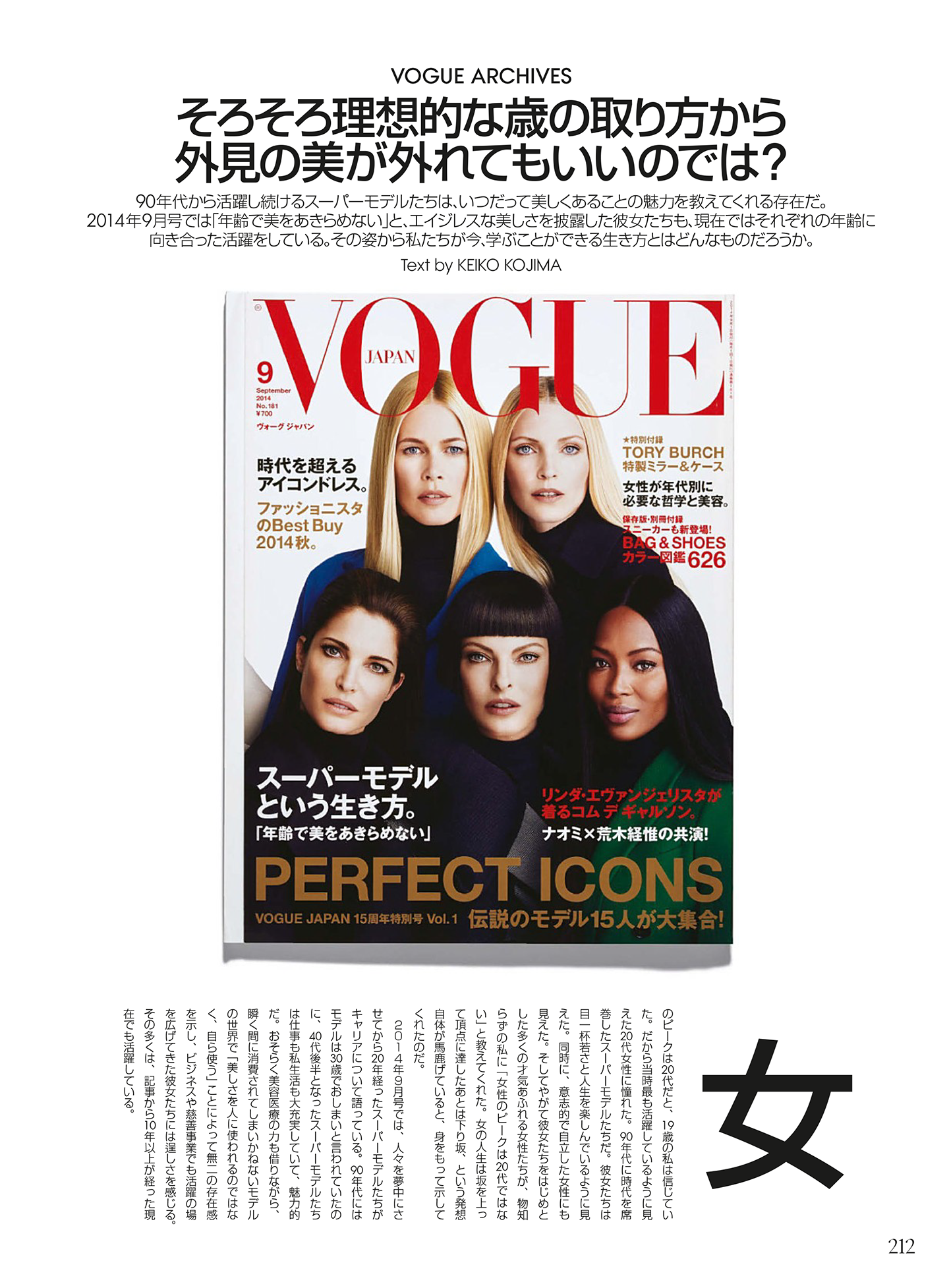
Han-based writing systems, which include Chinese, Japanese, and Korean, and so are sometimes known as CJK languages, were traditionally written vertically: start at the top right, the inline direction flows top-to-bottom, the block direction flows right-to-left. Today, it’s common to see a mixture of horizontal (left-to-right) and vertical writing - this page from the Japanese edition of Vogue magazine includes text using both writing modes:
In CSS, text can be horizontal, vertical, or sideways — with vertical intended for CJK languages that were traditionally written vertically, and sideways intended for rotating languages which are traditionally written horizontally.
Here’s “hello world” in English, Japanase (katakana ハロー ワールド, literally “Harō wārudo”, the transliterated title of the 2019 film “HELLO WORLD”), and Hebrew (שלום עולם - “Hello World”, a song by Galit Bell, which failed to qualify as Israel’s entry for the 1996 Eurovision Song Contest); each one is shown using the nine different combinations of writing-mode and text-orientation supported by CSS:
Even if you’re working on internationalised sites with some fairly complex design, the examples highlighted in blue are the only ones you’re ever likely to use in production - and the faded-out examples are duplicates; they produce the same effect as another combination.
The exception here is if you need to support Mongolian script, which is written top-to-bottom, left-to-right, but with glyphs oriented with their “baseline” towards the left edge. But we’re not going to get into that, no matter how interesting it sounds.
Things to note:
text-orientationonly affectsverticaltext - notsidewaystext.- Glyphs have an intrinsic orientation. If we write English text vertically, we rotate the letters and the lines - if we want the lines flowing vertically but don’t want to rotate the letters, we need to specify
text-orientation: upright. If we write Japanese text vertically, the glyphs stay upright; if we want to rotate them, we have to specifytext-orientation: sideways
Top, Right, Bottom, Left, Inline, Block, Start, End
Specifying borders, margins and padding in terms of top/left/bottom/right doesn’t always cope well with alternative writing systems, so CSS encourages us to think in terms of the block and inline axis of each element:
As well as the individual top, right, bottom, and left variants of each property, CSS also lets us specify them in terms of the block and inline axis, with -start and -end variants for each axis property.
	html {
		text-align: center;
		font-family: Consolas, 'Courier New', Courier, monospace;
		background: black;
		color: white;
	}

	* {
		box-sizing: border-box;
	}

	article {
		display: flex;
		gap: 20px;
		justify-content: space-around;
	}

	section {
		&:only-of-type {
			div {
				inline-size: 20vw;
				block-size: 70px;
			}
		}
		background: white;
		color: black;
		flex: 1;
		div {
			vertical-align: text-top;
			display: inline-block;
			inline-size: 70px;
			block-size: 19vw;
			margin: 10px;
			background-color: gold;
			padding: 10px;
			position: relative;
		}

		div:nth-of-type(1) {
			border-top: 10px solid purple;
			border-left: 10px solid forestgreen;
		}

		div:nth-of-type(2) {
			border-block: 10px solid royalblue;
		}

		div:nth-of-type(3) {
			border-inline: 10px solid crimson;
		}

		div:nth-of-type(4) {
			border-block-start: 10px solid royalblue;
			border-inline-end: 10px solid crimson;
		}
	}
<pre>Direction: ltr (left-to-right)</pre>
<article>
	<section>
		<div>top, left</div>
		<div>block</div>
		<div>inline</div>
		<div>block-start + inline-end</div>
	</section>
</article>
<article>
	<pre>vertical-lr</pre>
	<pre>vertical-rl</pre>
	<pre>sideways-lr</pre>
	<pre>sideways-rl</pre>
</article>
<article>
	<section style="writing-mode: vertical-lr;">
		<div>A a<br>B b</div>
		<div>C c<br>D d</div>
		<div>E e<br>F f</div>
		<div>G g<br>H h</div>
	</section>
	<section style="writing-mode: vertical-rl;">
		<div>A a<br>B b</div>
		<div>C c<br>D d</div>
		<div>E e<br>F f</div>
		<div>G g<br>H h</div>
	</section>
	<section style="writing-mode: sideways-lr;">
		<div>A a<br>B b</div>
		<div>C c<br>D d</div>
		<div>E e<br>F f</div>
		<div>G g<br>H h</div>
	</section>
	<section style="writing-mode: sideways-rl;">
		<div>A a<br>B b</div>
		<div>C c<br>D d</div>
		<div>E e<br>F f</div>
		<div>G g<br>H h</div>
	</section>
</article>
<hr>
<pre>Direction: rtl (right-to-left)</pre>
<article>
	<section>
		<div>top, left</div>
		<div>block</div>
		<div>inline</div>
		<div>block-start + inline-end</div>
	</section>
</article>
<article>
	<pre>vertical-lr</pre>
	<pre>vertical-rl</pre>
	<pre>sideways-lr</pre>
	<pre>sideways-rl</pre>
</article>
<article>
	<section style="writing-mode: vertical-lr;">
		<div dir="rtl">A a<br>B b</div>
		<div dir="rtl">C c<br>D d</div>
		<div dir="rtl">E e<br>F f</div>
		<div dir="rtl">G g<br>H h</div>
	</section>
	<section style="writing-mode: vertical-rl;">
		<div dir="rtl">A a<br>B b</div>
		<div dir="rtl">C c<br>D d</div>
		<div dir="rtl">E e<br>F f</div>
		<div dir="rtl">G g<br>H h</div>
	</section>
	<section style="writing-mode: sideways-lr;">
		<div dir="rtl">A a<br>B b</div>
		<div dir="rtl">C c<br>D d</div>
		<div dir="rtl">E e<br>F f</div>
		<div dir="rtl">G g<br>H h</div>
	</section>
	<section style="writing-mode: sideways-rl;">
		<div dir="rtl">A a<br>B b</div>
		<div dir="rtl">C c<br>D d</div>
		<div dir="rtl">E e<br>F f</div>
		<div dir="rtl">G g<br>H h</div>
	</section>
</article>Review & Recap
- Elements on a page are either block-level or inline elements
- Block-level elements (e.g.,
<p>,<div>) start on a new line and occupy the full width of the page. - Inline elements (e.g.,
<em>,<span>) flow within text and take only as much space as their content. - Elements have a content box, surrounded by padding, then border, and then a margin - this is known as the CSS box model
- Margins of adjacent elements will collapse
- The
padding,borderandmarginwidth are specified using CSS units, in the order top, right, bottom, left - it’s clockwise from the top, or you can use the mnemonic trouble to remember the order. - CSS units are absolute (
px,cm,pt) or relative. Relative units includeem(relative to the current font size),rem(relative to the document’s root font size),vwandvh(relative to the viewport width and height), or a percentage%of the parent element. - The
floatproperty will pull an element out of normal flow, allowing text or other elements to wrap around it. - The
box-sizingproperty controls whether an element’s width includes padding and border (border-box) or the padding and border are added to the specified width (content-box).border-boxis far more useful and intuitive, but for historical reasonscontent-boxis the default.