In the section on boxes & borders, we learned about border-width, border-style and border-color - basically, a bunch of ways to draw a line around a box.
Let’s meet some of the more advanced things we can do with CSS borders
Rounded Corners with border-radius
For a long while, rounded corners was a sure sign somebody had spent a great deal of time — and money — on a website; with no native support in HTML or CSS, rounded corners meant painstakingly creating button and UI elements in Photoshop or Macromedia Fireworks, exporting tiny slices of images and reassembling them using HTML tables.
Thankfully, these days, if you want rounded corners on an element, you just specify a border-radius - and boy howdy, we have a lot of syntaxes to choose from.
If we specify the radius as a length, we get
border-radius: 10px- apply a 10px radius to all four corners
border-radius: 10px 20px- apply a 10px radius top-left and bottom-right; 20px radius top-right and bottom-left
border-radius: 10px 20px 30px- 10px top-left, 20px top-right and bottom-left; 30px bottom-right
border-radius: 10px 20px 30px 40px- 10px top-left, 20px top-right; 30px bottom-right, 40px bottom-left
	* {
		box-sizing: border-box;
		text-align: center;
		font-family: Consolas, 'Courier New', Courier, monospace;
	}

	div {
		font-size: 0.6rem;
		border: 2px solid royalblue;
		background-color: gold;
		padding: 50px 0px;
		width: 29vw;
		display: inline-block;
		margin: 5px;
	}
<div style="border-radius: 25px;">border-radius: 25px;</div>
<div style="border-radius: 25px 100px;">border-radius: 25px 100px;</div>
<div style="border-radius: 5px 25px 75px;">border-radius: 5px 25px 75px;</div>
<div style="border-radius: 5px 25px 50px 75px;">border-radius: 5px 25px 50px 75px;</div>
<div style="border-radius: 0 200px;">border-radius: 0 200px;</div>
<div style="border-radius: 0 0 0 200px;">border-radius: 0 0 0 200px;</div>
<div style="border-radius: 200px 200px 0 0;">border-radius: 200px 200px 0 0;</div>
<div style="border-radius: 200px;">border-radius: 200px;</div>
<div style="border-radius: 50px 50px 50px 0;">border-radius: 50px 50px 50px 0;</div>If you specify the border radius as a percentage, and the element isn’t a square, you’ll get an elliptical border:
* {
box-sizing: border-box;
text-align: center;
font-family: Consolas, 'Courier New', Courier, monospace;
}
section {
&:nth-of-type(1) div { border-radius: 25%; }
&:nth-of-type(2) div { border-radius: 50%; }
&:nth-of-type(3) div { border-radius: 100% 0; }
&:nth-of-type(4) div { border-radius: 100% 0 0 0; }
div {
padding: 3vw;
height: 8vw;
}
div:nth-of-type(1) {
width: 50vw;
}
div:nth-of-type(2) {
width: 20vw;
}
div:nth-of-type(3) {
width: 6vw;
}
div:nth-of-type(4) {
width: 5vw;
}
}
div {
font-size: 0.75rem;
border: 2px solid royalblue;
background-color: gold;
display: inline-block;
margin: 5px;
}
<section>
<div>25%;</div>
<div> </div>
<div> </div>
<div> </div>
</section>
<section>
<div>50%;</div>
<div> </div>
<div> </div>
<div> </div>
</section>
<section>
<div>100% 0;</div>
<div> </div>
<div> </div>
<div> </div>
</section>
<section>
<div>100% 0 0 0;</div>
<div> </div>
<div> </div>
<div> </div>
</section>
You can also create an elliptical border by specifying a second set of radii, separated from the first set with a forward slash /:
	* {
		box-sizing: border-box;
		text-align: center;
		font-family: Consolas, 'Courier New', Courier, monospace;
	}

	div {
		font-size: 0.75rem;
		border: 2px solid royalblue;
		background-color: gold;
		padding: 50px 0px;
		width: 29vw;
		display: inline-block;
		margin: 5px;
	}
<div style="border-radius: 25px / 50px;">25px / 50px;</div>
<div style="border-radius: 100px / 20px;">100px / 20px;</div>
<div style="border-radius: 50px 0 / 100px 0;">50px 0 / 100px 0;</div>
<div style="border-radius: 25px 25px 100px 100px / 50px;">25px 25px 100px
	100px / 50px;</div>
<div style="border-radius: 100px / 25px 50px 75px 100px;">100px / 25px 50px
	75px 100px;</div>
<div style="border-radius: 0 0 0 200px / 0 0 0 50px;">0 0 0 200px / 0 0 0
50px;</div>Using Border Images
If you can’t achieve the border effect you need using the built-in styles, CSS also allows you to use an image as an element border – and as we saw in the last section, CSS images include several different kinds of gradient function.
Border images in CSS are based on 9-slice scaling, a technique for resizing an image that preserves the borders and corners:

This means that to use an image as a border, we need to consider how the image will be sliced, and how those slices will be assigned to the nine parts of the border (well, actually eight parts - four corners, four edges - but you can also use the fill keyword to preserve the middle part of the border image as an extra background layer on the element’s content)
Border images can be a little baffling because you need to provide multiple properties in the right combination for them to do anything at all — get one wrong, or miss one out, and you just won’t get a border.
- You must provide a
border-image-source,border-image-sliceandborder-image-width - You must also
To understand how slice works, we’re going to use this background image:

The border-image-slice property takes one or more numbers - either unitless numbers or percentages. If they’re unitless, and the border-image-source is a bitmap, the numbers are pixels (if you’re using something like an SVG as a border image, unitless numbers are interpreted as coordinates, so you’re better off using percentages.)
The number specifies where to slice the image. If you specify one number, it’ll slice that distance from each edge:
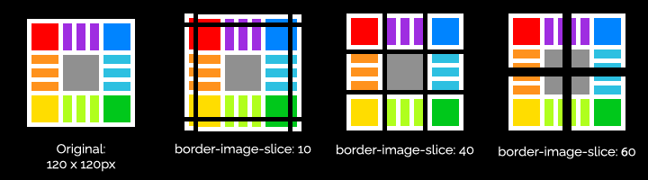
The key to understanding this is that if the number is more than half the size of the image, there’s nothing left for the edges - and if the number is equal to, or greater than, the size of the image, it’ll just give you a copy of the border image in each corner.
	body {
		background-color: #000;
		padding: 10px;
		margin: 0;
	}

	section {
		display: flex;
		flex-wrap: wrap;
		gap: 20px;
		justify-content: space-around;
	}

	div {
		background-color: #fff;
		color: #000;
		font-family: Consolas, 'Courier New', Courier, monospace;
		font-size: 0.6em;
		display: flex;
		align-items: center;
		justify-content: center;
		width: 8vw;
		height: 8vw;
		border-image-source: url(9-slice.png);
		border-width: 40px;
		border-style: solid;
	}
<section>
	<div style="border-image-slice: 6">6</div>
	<div style="border-image-slice: 10">10</div>
	<div style="border-image-slice: 20">20</div>
	<div style="border-image-slice: 40">40</div>
	<div style="border-image-slice: 49%">49%</div>
	<div style="border-image-slice: 50%">50%</div>
	<div style="border-image-slice: 80">80</div>
	<div style="border-image-slice: 120">120</div>
</section>If you provide more than one number, it uses the same t-r-b-l shorthand syntax as other CSS border properties:
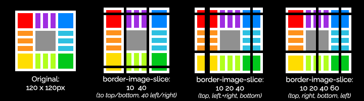
border-image-slice: 10% 50%- 10% top and bottom; 50% left and right
border-image-slice: 10% 20% 30%- 10% top, 20% left and right, 30% bottom
border-image-slice: 10% 20% 30% 40%- 10% top, 20% right, 30% bottom, 40% left
Finally, if you include the fill keyword anywhere in the border slice property, it’ll use the central slice as the element background:
<!DOCTYPE html>
<html lang="en">
<head>
	<meta name="viewport" content="width=device-width, initial-scale=1.0">
	<title>border-image-slice</title>
	<style>
		body {
			background-color: #000;
			padding: 10px;
			margin: 0;
		}

		section {
			display: flex;
			flex-wrap: wrap;
			gap: 20px;
			justify-content: space-around;
		}

		div {
			background-color: #fff;
			color: #000;
			font-family: Consolas, 'Courier New', Courier, monospace;
			font-size: 0.6em;
			display: flex;
			align-items: center;
			justify-content: center;
			width: 8vw;
			height: 8vw;
			border-image-source: url(9-slice.png);
			border-width: 40px;
			border-style: solid;
		}
	</style>
</head>
<body>
	<section>
		<div style="border-image-slice: 10 40">10 40</div>
		<div style="border-image-slice: 10 20 40">10 20 40</div>
		<div style="border-image-slice: 10 20 40 60">10 20 40 60</div>
		<div style="border-image-slice: 10 40 fill">10 40 fill</div>
	</section>
</body>
</html>Border Image Outset and Border Image Repeat
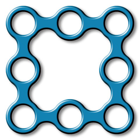
For these examples, we’re using this transparent PNG as our border image: 9-slice-chain.png
border-image-outset — another t-b-r-l property — specifies the distance between the element’s border box and the border image.
	* { box-sizing: border-box; }
	body {
		background-color: #000;
		padding: 50px 10px;
		margin: 0;
	}

	section {
		display: flex;
		flex-wrap: wrap;
		gap: 20px;
		justify-content: space-around;
	}

	div {
		background-color: white;
		border-radius: 15px;
		color: #000;
		font-family: Consolas, 'Courier New', Courier, monospace;
		font-size: 0.6em;
		display: flex;
		align-items: center;
		justify-content: center;
		width: 120px;
		height: 120px;
		border-image-source: url(9-slice-chain.png);
		border-width: 40px;
		border-style: solid;
		border-image-slice: 160;
		border-image-width: 40px;
	}
<section>
	<div style="border-image-outset: 0">6</div>
	<div style="border-image-outset: 10px; margin: auto 10px;">10px</div>
	<div style="border-image-outset: 20px; margin: auto 20px;">20px</div>
	<div style="border-image-outset: 40px; margin: auto 40px;">40px</div>
</section>border-image-repeat specifies how the slices should be repeated along the edges of the element:
	* { box-sizing: border-box; }
	body {
		background-color: #000;
		margin: 0;
	}

	section {
		display: flex;
		flex-wrap: wrap;
		gap: 20px;
		justify-content: space-around;
	}

	div {
		background-color: white;
		border-radius: 15px;
		color: #000;
		font-family: Consolas, 'Courier New', Courier, monospace;
		font-size: 0.6em;
		display: flex;
		align-items: center;
		justify-content: center;
		width: 45vw;
		height: 140px;
		border-image-source: url(9-slice-chain.png);
		border-width: 40px;
		border-style: solid;
		border-image-slice: 160;
		border-image-width: 40px;
	}
<section>
	<div style="border-image-repeat: stretch;">border-image-repeat: stretch</div>
	<div style="border-image-repeat: repeat;">border-image-repeat: repeat</div>
	<div style="border-image-repeat: round;">border-image-repeat: round</div>
	<div style="border-image-repeat: space;">border-image-repeat: space</div>
</section>and finally, border-image-width works like border-width, but for the image border rather than the regular CSS border:
	* { box-sizing: border-box; }
	body {
		background-color: #000;
		margin: 0;
	}

	section {
		display: flex;
		flex-wrap: wrap;
		gap: 20px;
		justify-content: space-around;
	}

	div {
		background-color: white;
		border-radius: 6px;
		color: #000;
		font-family: Consolas, 'Courier New', Courier, monospace;
		font-size: 0.6em;
		display: flex;
		align-items: center;
		justify-content: center;
		width: 40vw;
		height: 140px;
		border-image-source: url(9-slice-chain.png);
		border-width: 40px;
		border-style: solid;
		border-image-slice: 160;
		border-image-repeat: round;
	}
<section>
	<div style="border-image-width: 15px;">15px</div>
	<div style="border-image-width: 40px;">40px</div>
	<div style="border-image-width: 20px 40px;">20px 40px</div>
	<div style="border-image-width: 10px 20px 40px 60px;">10px 20px 40px 60px</div>
</section> Using border-image shorthand
Yep, you guessed it: there’s a shorthand syntax if you don’t want to specify each property individually. To recap, the complete set of border image properties is:
border-image-source- an image URL or a gradient functionborder-image-slice- one to four unitless values or percentagesborder-image-width- one to four lengthsborder-image-outset- one to four lengthsborder-image-repeat- one of the keywordsstretch,repeat,roundorspace
The shorthand syntax is:
border-image: source slice / width / outset repeat
Should you use it?
Well… it depends. If you’re specifying a single value for slice, a single value for width and maybe a repeat, it’s probably fine. But take a look at these examples and tell me if you want to maintain a project that uses this sort of code.
	* {
		box-sizing: border-box;
	}

	body {
		padding: 20px 20px 40px 20px;
		display: flex;
		gap: 100px;
	}

	div {
		width: 120px;
		height: 120px;
		background-color: #000;
	}

	div#a {
		border-image: url('9-slice.png') 40 / 10px 20px 30px 40px stretch;
	}

	div#b {
		border-image: repeating-conic-gradient(
			red 1deg 10grad, purple 0.5turn 2rad, teal 80% 90%, gold, red
		) 10% 20 30% 50% / 1vw 20pt 30q 0.2in / 20px 30px 40px 50px round;
	}

	div#c {
		border-image: url('9-slice-chain.png') 160 / 20px round;
	}
<div id="a"></div>
<div id="b"></div>
<div id="c"></div>CSS Border Hacks
OK, we’ve looked at a bunch of things CSS borders were supposed to do. Time to learn about some things that definitely weren’t part of the design, but turn out to be incredibly useful anyway.
Perhaps the most useful one is a way to make triangles. CSS is great at rectangles, and using border-radius we can create all kinds of curved shaped, but triangles has always been a bit tricky.
Take a look at this example:
	div {
		margin: 0 auto;
		width: 100px;
		height: 100px;
		border-width: 20px;
		border-style: solid;
		border-color: red aqua purple gold;
		display: flex;
		justify-content: center;
		align-items: center;
	}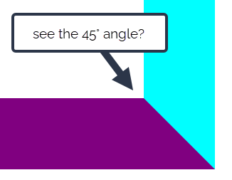
<div>hello!</div>Look closely at the corners of the <div>, you’ll see the borders create a 45° mitre joint:
Now, watch what happens if we set the width and height of the element to 0, so it ends up all border and no content:
	div {
		margin: 0 auto;
		width: 0px;
		height: 0px;
		border-width: 70px;
		border-style: solid;
		border-color: red aqua purple gold;
		display: flex;
		justify-content: center;
		align-items: center;
	}
<div> </div>Next we’re going to change the border widths:
	div {
		margin: 0 auto;
		width: 0px;
		height: 0px;
		border-width: 10px 70px 130px 70px;
		border-style: solid;
		border-color: red aqua purple gold;
		display: flex;
		justify-content: center;
		align-items: center;
	}
<div> </div>That purple border is starting to look distinctly triangular, hey?
Now, if we set the top border to zero, and change the colours of the other borders to transparent:
	div {
		margin: 0 auto;
		width: 0px;
		height: 0px;
		border-width: 0px 70px 140px 70px;
		border-style: solid;
		border-color: transparent transparent  purple transparent;
		display: flex;
		justify-content: center;
		align-items: center;
	}
<div> </div>…we’ve made a triangle using pure CSS.
OK, so what can we do with it?
I’ve used this kind of technique on several projects to create a navigation indicator, adding a tiny triangle beneath the nav link for whichever page is currently active. This example uses the :target pseudo-class to target the navigation element matching the current URL, along with an absolute-positioned ::after pseudo-element that creates the triangular border effect.
	html,
	body {
		margin: 0;
		padding: 0;
	}

	* {
		font-family: Arial, Helvetica, sans-serif;
		box-sizing: border-box;
	}

	nav {
		margin: 10px auto;
		background: #036;

		a {
			color: #fff;
			text-decoration: none;
			display: inline-block;
			padding: 0.8rem;
			position: relative;

			&:target::after {
				content: ' ';
				border-width: 0 0.5rem 0.8rem 0.5rem;
				border-color: transparent transparent white transparent;
				border-style: solid;
				position: absolute;
				bottom: 0;
				margin-inline: auto;
				left: 0;
				right: 0;
				width: 0;
			}
		}
	}
<nav>
	<a id="home" href="#home">home</a>
	<a id="guitars" href="#guitars">guitars</a>
	<a id="basses" href="#basses">basses</a>
	<a id="amps" href="#amps">amps</a>
	<a id="pedals" href="#pedals">pedals</a>
</nav>Another scenario that’s come up several times in my own career is creating a “speech bubble” callout - see the linked exercise for a walkthrough of how to do this.